How is the Design Change of App4Event Going
In this article we will take a look at our event app from a designer point of view. You will find out about the design change for each new event and also which trouble we had to deal with.
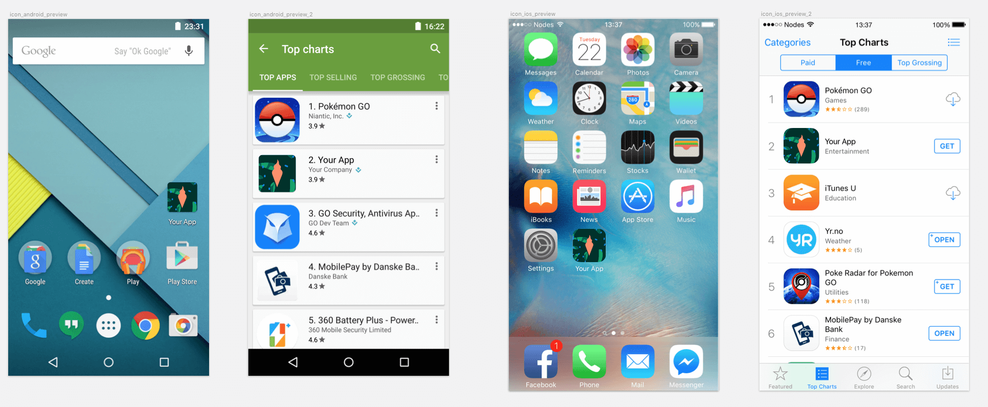
We said NO to paper programs
App4Event is a mobile app for festivals and conferences that we are internally developing in Ackee since 2014. It includes everything that such an application allows – a list of performers and events, timeline, notifications, maps, location overview, news, chat, surveys and much more. Its big advantage is the possibility to easily implement your own design.
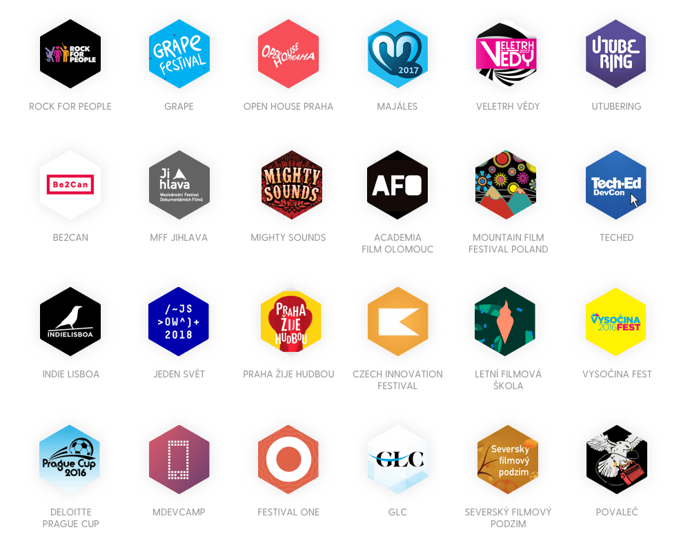
We divide the application based on the event type to the festival (music, film) and conference part. This year we will release around 20 individual applications, we have reached as far as Australia so far. We knew that with the increasing number, there will be a need to prepare a universal solution, so that each festival takes as little time for design and development as possible.
What have the designers dealt with?
The first designs were done in Photoshop (Sketch was only at its baby stage). During the design of each event we sent a manual to the client based on which they sent us a color scheme and if they had any, they also sent us their graphic materials of their brand. We have updated colors in each PSD, exchanged graphic materials and exported a preview to the clients and materials for the developers. There were three problems linked to this process that slowly started to complicate the development:
- Any changes meant a modification of each separate file. More designers have dealt with this issue and it was one of the main reasons we have moved to Sketch and other alternatives.
- App4Fest as a product is innovated all the time. There are new functionalities added and old are modified based on testing.
- During design modification for a new festival, we had to modify the appearance of the screens where the brand was manifesting the most gradually. That means opening all source files, set the colors, change graphics, export graphic materials including previews for clients, application icons and graphics for Stores… it was quite a mess.
As soon as we had a little free time, we decided to redo the whole application into Sketch. We knew that it would allow us to get a single beautiful file which:
- Will be easy to modify for a specific festival
- Will speed up work on new features
- Will allow easy export of previews to clients and materials for developers
Sketch, finally!
When designing new templates in Sketch, we had to think about how to make it as universal as possible and at the same time easy to understand for anybody who will work with it in the future. The structure was designed in a way that made it possible to easily modify the appearance based on the current event and at the same time to be able to improve individual screens or design whole new sections.
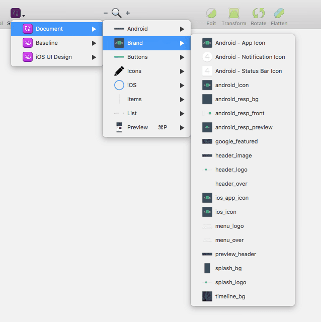
Structure of the pages
- Styles & Symbols: change colors and graphics accross the application
- Android: list of all final screens of the application
- Playground: testing of screen versions and new functionalities
- App Icon: previews of icons for App store and Google Play
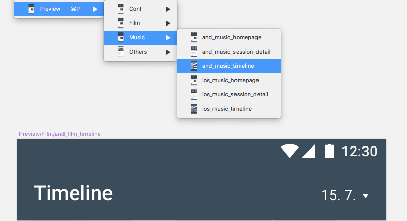
- Preview: previews of screens for individual types of events (movie, music, conference), including mockups
We have decided to only work with the platform for Android, due to minimal differences. For iOS, we have only prepared the most important screens which we send to clients as mockups and that can be further used for marketing purposes.
Symbol Structure
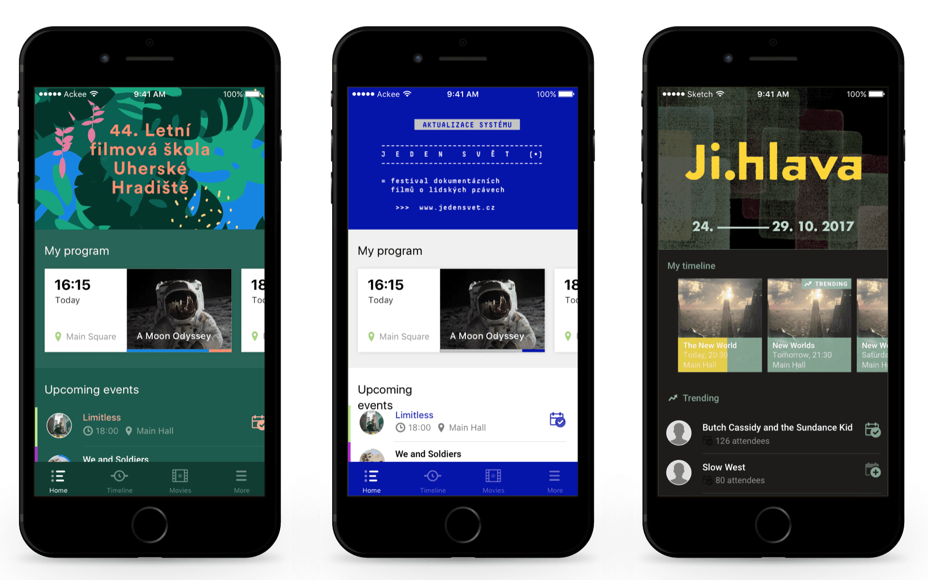
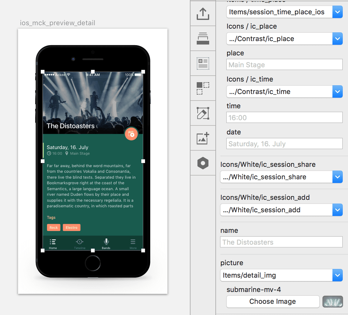
The symbol structure is shown in the following screenshot. It is worth mentioning the groups of symbols called Brand and Preview. Brand includes symbols, whose content (logo, splash screen, app icon) changes for each festival. The Preview Tab includes previews of screens for different types of events (movie, music, conference).
Colors
The basic of each event is the color scheme. In order to be able to easily change the colors based on the brand, we have prepared the structure in a way to make it possible to change the colors in the whole application on one click.
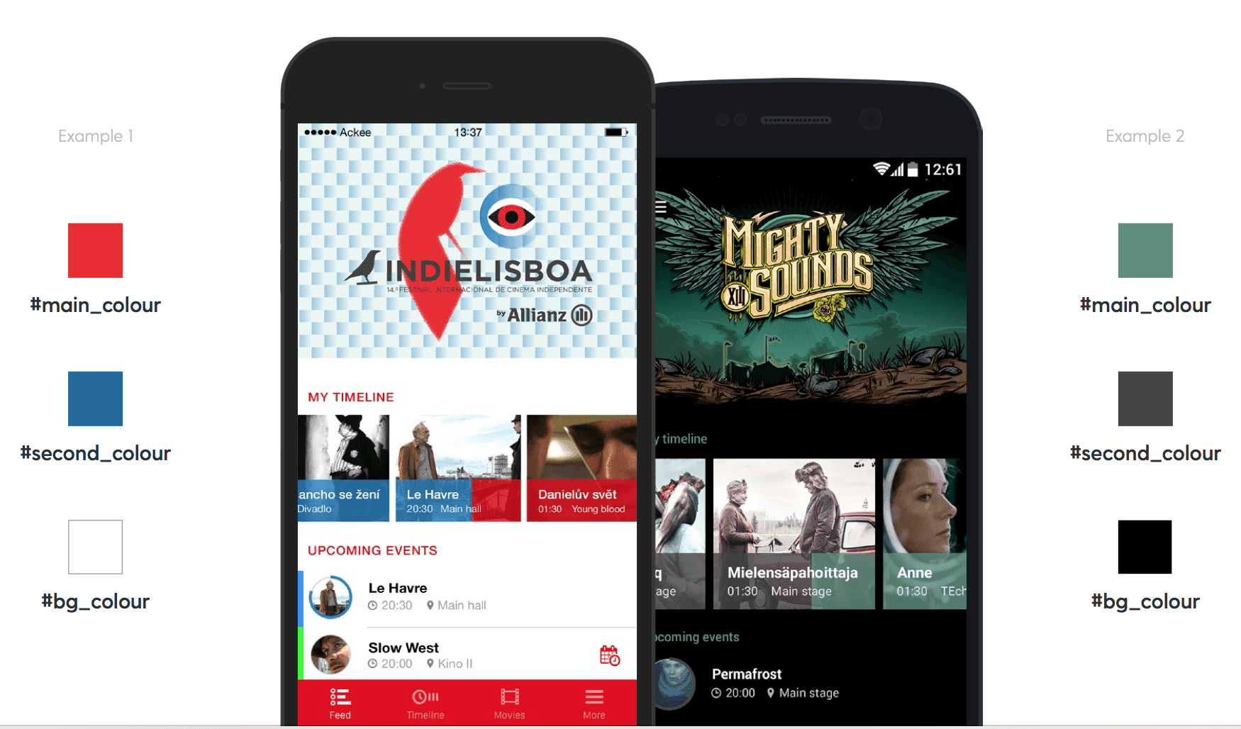
For each new event, we update a total of 8 colors. Brand colors, background and text color. After the update of style in objects with color we change the text color. We use the table below where we have an overview of all texts that are used in the application – including their color for verification.
Global changes in Sketch using own style and symbols is currently nothing new, but it is necessary to think it through. The principle is simple. All colors (for example contrast color) are used across the design with 100% fill.
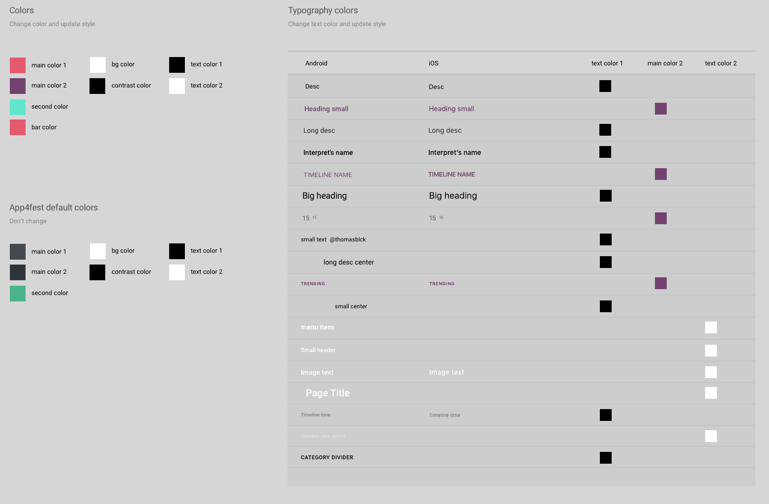
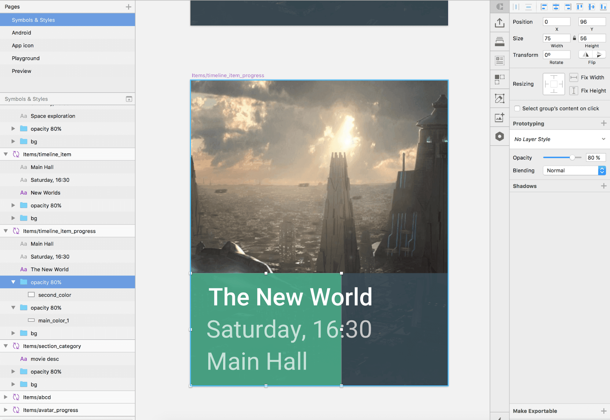
In case it is necessary to use a color with less fill, we envelop the layer with an element where we adjust transparency. That makes it possible to modify the shade easily without changing the style of the object. Even shadows could not be applied directly to the color style (we do not use them everywhere), we had to use an independent layer with the shadow.
Graphics
After the color changes it is time to modify the graphic materials. Among the most visible are the main motive of the festival, splash screen and the timeline background. The most interesting is probably the main motive placed on the dashboard which is made of 3 layers in order to be able to achieve the parallax effect at swipe. The resulting picture is subsequently used as Google featured in Google Play store.
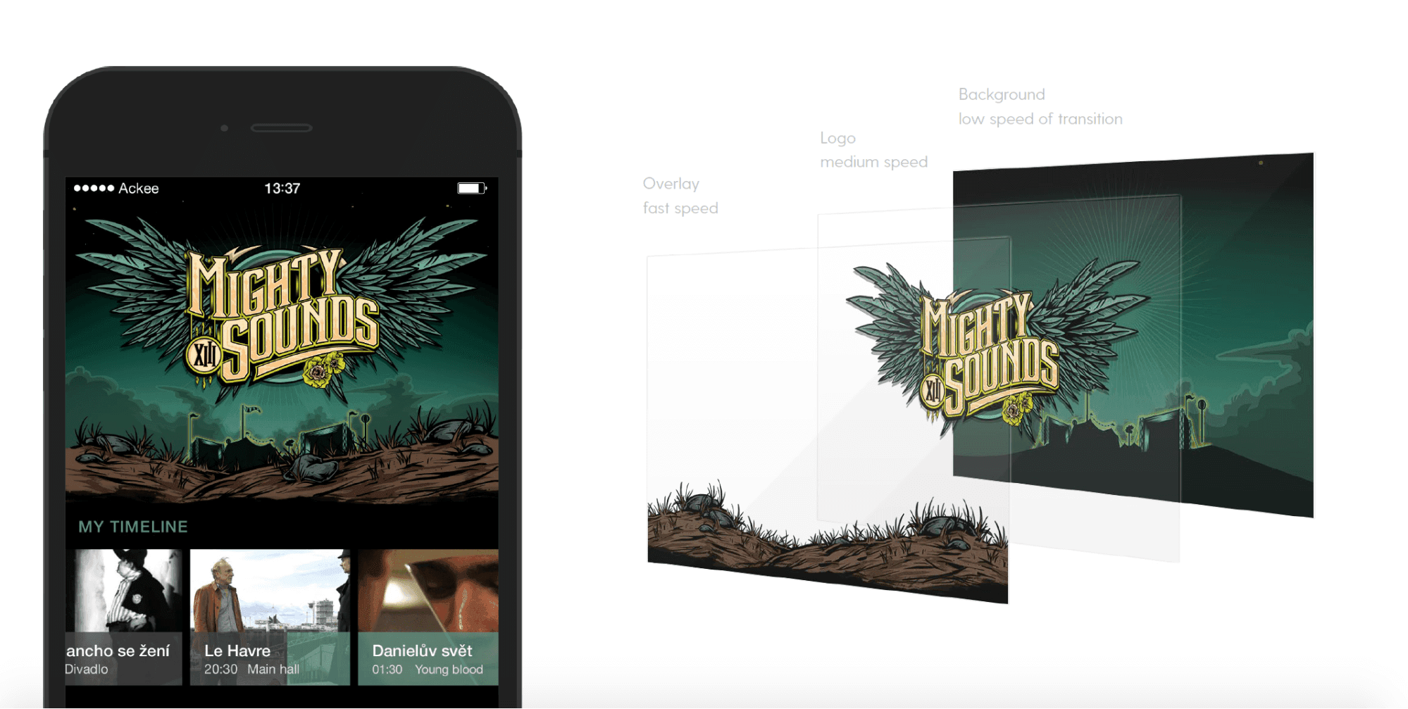
Due to the high number of devices and rotation of the application to landscape, the picture needs to be wide-angle (3072x795px). After that it is only cut on the sides based on the resolution of the device. At the same time, the logo needs to always remain visible which we check using simple guidelines. And last but not least – we try to update our sources also based on newest devices, so we currently added for example the notch from iPhone X.
The next step is changing the icons. There are application icons, a status bar icon and a notification icon. The last two were unfortunately often overlooked in the past. For new Android, we have also added a responsive icon.
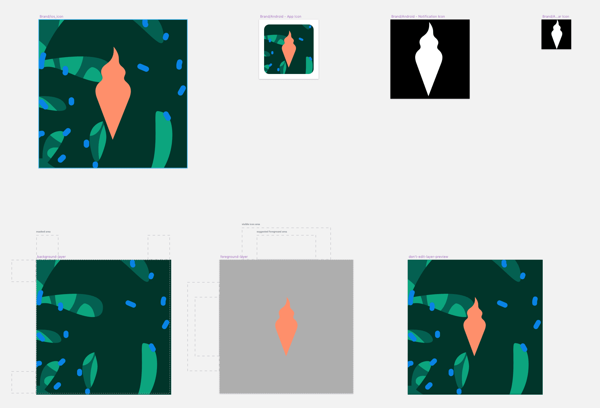
For the application icons we first prepare the design within a symbol which we later apply to the complete structure for export for different platforms. This structure is done separately mostly because of a different number of sizes and density with iOS.
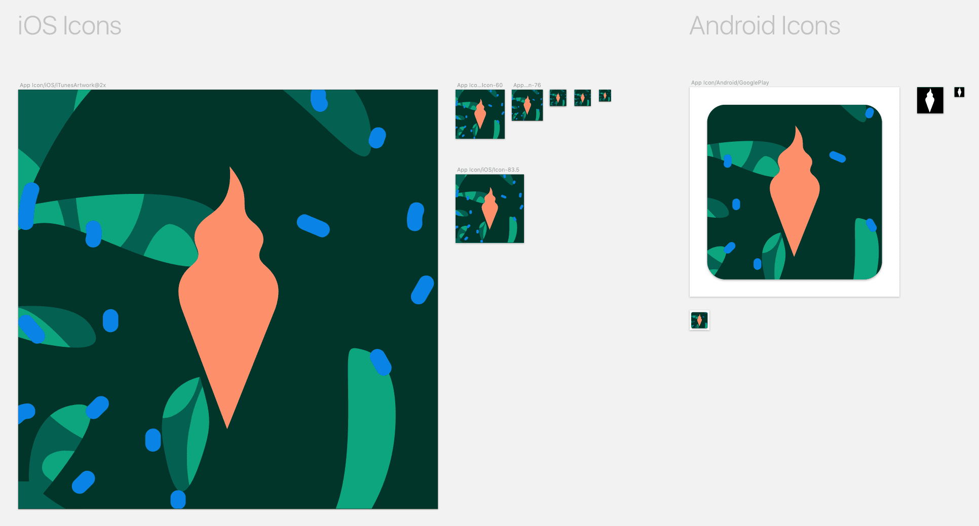
In the end we check how the application icons look on both platforms and we send these screens for a check to the clients as well. It is no secret that whenever we can, we use already made templates that are freely available on the internet and integrate them into our Sketch file.
For all event types (movie/music/conference) and both platforms, we have created 3 main screens (dashboard, timeline, detail) which are converted to symbols. And why?
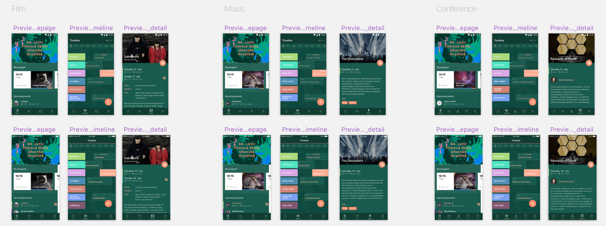
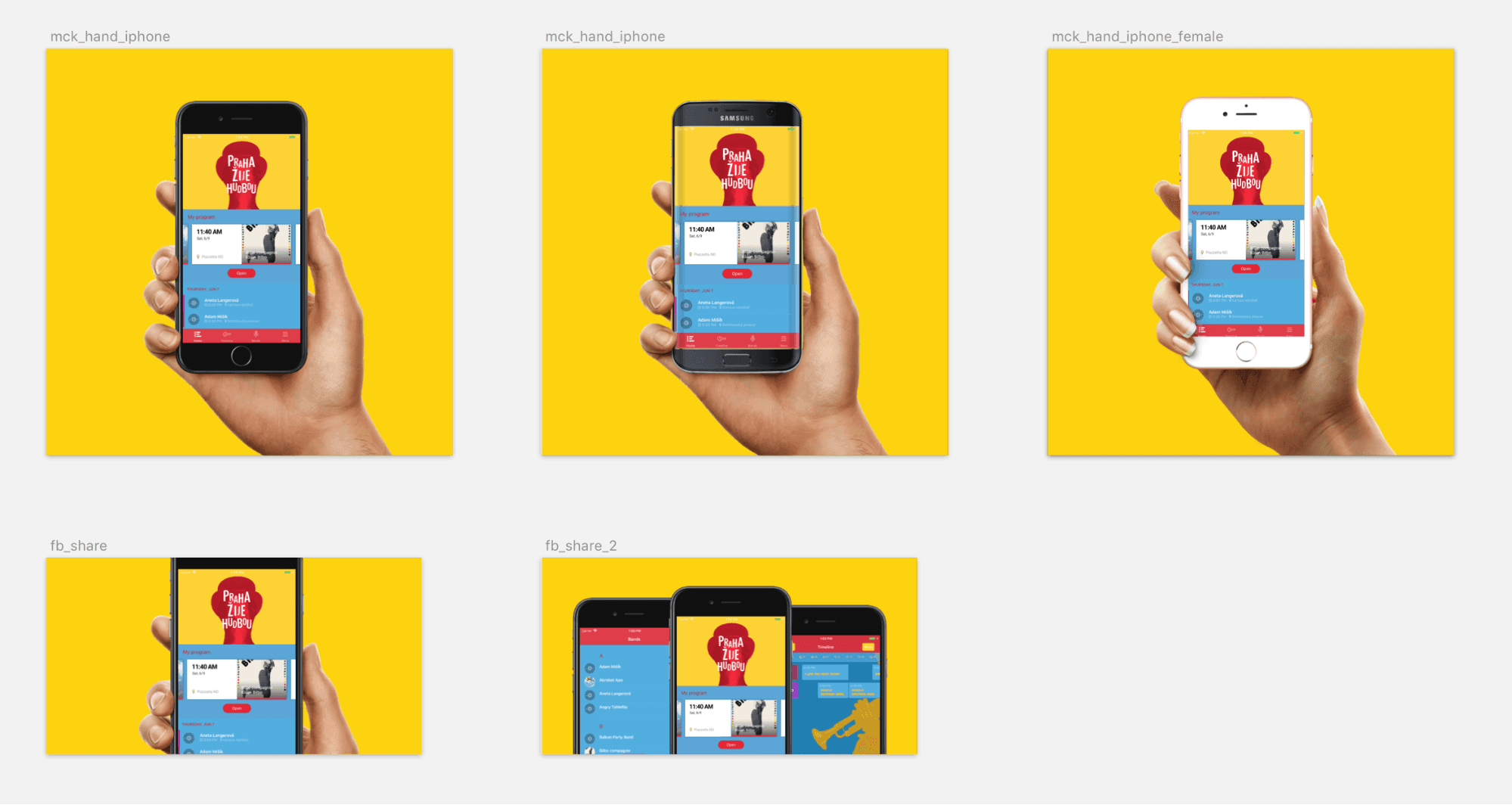
The symbols are subsequently inserted as a source to mobile devices mockups which we send to the clients. The advantage of this solution is that we can rewrite the whole content of the symbols. At this stage of development, we usually do not have a list of interpreters or the names of movies or lectures from the client. For each event, we only have draft names and it is sometimes necessary to adjust the content for a given festival or to attract new clients.
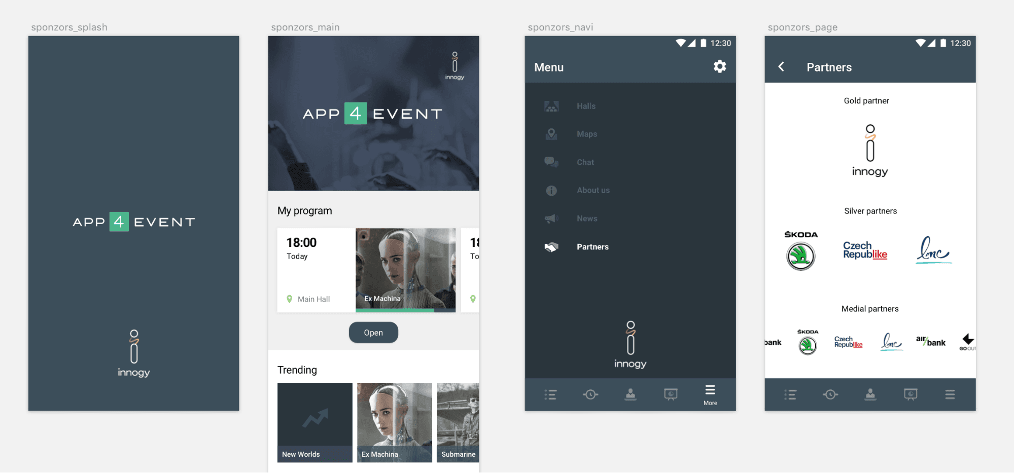
We also do not forget the sponsoring which is extremely important to the organizers. There are several places in the application where it is possible to promote it. The logo is again done as a symbol which we use across the application.
Exports
I have mentioned at the beginning that we want to export all at one click. During the design of a new event, we only have the Sketch file in the folder, all other folders or files are made automatically during the export. In some cases, we have the export structure already outlined in the artboard name, in order cases we solve it by adding a prefix. With some artboards we have used fixed width setting (for example 720w for the width of the exported artboard). The only thing that we have still not managed to get to is automatic generation of colors from Sketch to the text file. Maybe next time ?
Exported Structure:
- App Icon: The application icon in all formats necessary for developers, including a responsive icon for new versions of Android.
- Brand:Includes graphic materials derived from the brand of a given event. These materials are also taken over by developers.
- PNG: List of all screens.
- Preview: Screens sent to the clients. Screen previews in mockup and application icons are included.
Lately, we often deal with the client requirement to also prepare graphic materials for social networks. So far, we have only created a few general mockups, into which we insert screenshots from the application.
A Few Concluding Remarks
We aim to improve the application in our free moments, so feedback is very important for us. We use analytical tools that we release with each event as well as user evaluations. And last but not least, of course our own experience, as we are active participants of several movie and music festivals, so we can observe the application use first hand. We know that there is always room for improvement…
In this blog, I wanted to share with you some of our processes and give a peak at how we work on festival design, even for people who are not from the field. As it often happens, I would do some things differently now (also thanks to the fact that Sketch has made a huge leap forward). The used processes are not special on their own, but together they create an interesting system that helps to make the work on each new event much easier.