Every Trend Dies Eventually. What Matters is to be at the Birth of the New One

Interview Not Only about Redesign
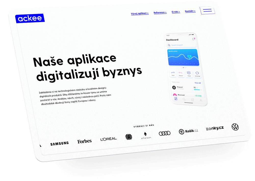
Ackee has a new web, and we call it Web 2020. But it didn't come out of the blue. What was behind its creation process? And why was it time to say goodbye to the old blue web from 2016? Our head of design Roman Gordienko gives you answers for these questions.
Why have you decided to remodel the facade?
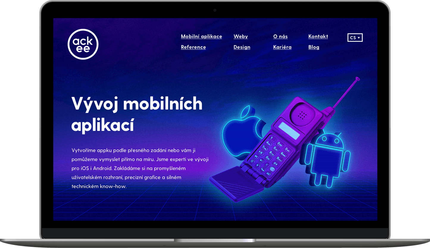
To get to why we have redesigned the website and what led us to it, I should start with the way it used to be. The need and impulse to change our previous visual identity to a new one came with the moving to the new offices in Karlín. That was in 2016. We had the logo ready in autumn, and at the end of the year, we managed to launch the blue website. After almost four years, we have now said goodbye to that and welcomed the new Web 2020, which naturally follows our existing visual identity.
What was at that time its basic building block?
Basic RGB colours from the set Web Safe Colours. Colours displayed as intended by the author because the browser fails to interpret the other colours correctly. Moreover, they were CGA palette colours (graphics of the first IBM computers from the ‘80s, a note of the redaction), which are basic digital colours. Well, we are a digital company and essentially, we don't make any physically tangible products (with a few exceptions), so we wanted to do something that exists only in that digital world. Nevertheless, this can become a problem sometimes. For example when you want to print something, because these colours are printing colours. :D
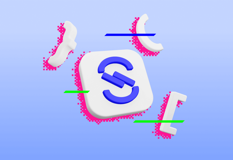
The basic colours were blue, white, black, pink and light blue (aqua). At the same time, brutalism began to form in the design community, returning to those primitive colors and shapes, large fonts, etc. Between 2015 and 2016 synthwave, retrowave and Outrun also trended… So it had its impact too. Web 2020 is still based on this colour palette, but we just said goodbye to the blue.
![]()
But not quite, right?
Definitely not! We didn't want to give it up completely, it has stayed, because it's still a part of our identity. And it's full of energy! We have preserved basically all the colors we had before. Along with our universe and from time to time rays flying through. But thanks to the white background, the site now looks much clearer.
On which wave of trend are we today?
Simple 3D shapes that are more abstract. Or at least that's how we perceive it in our design team – that now 3D is the trend on the rise. And we want to be a part of it. In the Czech Republic, we are among those who not only follow trends but also try to anticipate them. We don't wait for something to become mainstream. We have our voice, and it sets us apart from everyone else.
We had this in mind when creating the blue website from 2016. After its launch, it was interesting to observe an increase in the use of this colour in other Czech companies and industries from festivals to fashion magazines to agencies.
Even then, we tried to make it somehow ironic and funnier. To show that we are not a classic programming company, but that we can make a little fun of ourselves. It caused little concern for the management, but fortunately, it was unfounded.
Why has the change come right now?
The need to be a little more mature came. We are already somehow an established company. People know about us, and we don't have to shout so much about ourselves "we're here." We have already gained the attention we were asking for and looking for through the blue website’s look from 2016.
The trends we've used, 80's grids and so on… are now widely used and everyone has them. We also didn't enjoy working with it anymore. Every trend dies eventually. Even despite being a nice trend. But we don't want to stick to it at all cost.
„When redesigning the website, it was important for us to maintain the unique Ackee style and re-saddle the wave of modern design trends. We built the new design on strong typography and a set of 3D elements that now help us build a more modern and mature brand.”
However, the redesign shouldn't come from the fact that you don't like the web’s current appearance anymore, right?
Definitely not. From the user perspective, there were also several problems that we tried to solve. With the entire design team, we dedicated internal workshops to this – on the one hand, we formed our new design language, the direction we want to go, and what our values are. That was the driver of the new site.
The need for changes also arose from the data obtained from usability testing and research. What was right on that site and what was not. Already during the opening of our new branch in Germany, we did UX interviews with clients – what they like and dislike, how is the clarity of information and orientation in it. Our site’s targets are clients or potential new employees, so we had to consider their different needs. We didn't think about that much when creating the old website.
What is the main idea behind the web now?
Even now, it remains that we are primarily programmers and live in a digital world. But we don't want to present ourselves using a dry corporate website, so we chose 3D visuals and similar elements. And because the irony is still in us, there are also a few design jokes that are not visible at first glance. We wanted to show that we are more sophisticated in appearance and content. But we're still a little punk, and we want to keep our rebel Ackee spirit that we've always been proud of.
A redesign is (even in your words) a frequent trigger for a wave of criticism and hate. Why?
People can understand it in a way that no one asked them if they wanted the change.
And aren't they right? Doesn't redesign cause unnecessary waves?
It's not possible without them. On the other hand, some people don’t even notice the changes, because they have different perception settings. But we take it step by step, so the critique should be milder. And we are not finished, some content changes are also coming.
How did you set up the approval process and who had the last word?
Many people were involved in the project, and even though everyone defended some interests, everyone’s goal was to help the website. Nobody wanted to hurt it, everyone brought something in the end, and I think it turned out well. And most importantly, we learned a lot from it. Together with the frontend team, which was continually coming up with something new. We tried technologies we hadn't worked with before, for example 3D in the menu or 3D video and modelling.
What was the hardest part of the whole process?
Probably finding some balance. In that style – corporate versus cheeky – even in cooperation with a large project team.
And the last question – what do you consider to be a successful redesign?
The one that correctly reflects the changes in the company and takes into account the requirements of users. It should occur when the current design no longer sufficiently represents the values in the company and shows where they have moved.